The Notting Hill Peid-à-Terre
/This Notting Hill Maisonette has been such a joy to work on. I’m delighted to say it has been featured in Elle Decoration. We will be linking to the online article once it’s live, but you can buy the print edition, the April Elle Decoration magazine, out 29.02.24, from all good newsagents. All images of this project can be seen on the house tour page here.
In addition to the Elle Decoration coverage, I wanted to share my view here on my website on what we’ve achieved with this house and our experience of working with a small but really interesting space.
The first thing to say about this project, and as with our process, is that we always start with the client - and this client was bold, ambitious and a lot of fun to work with. He doesn’t work in a creative field (unlike many of our clients), so his creativity and openness initially surprised us - I am a big believer that anyone can be creative, so I was delighted with how he worked with us. The project developed with him very much at the centre.
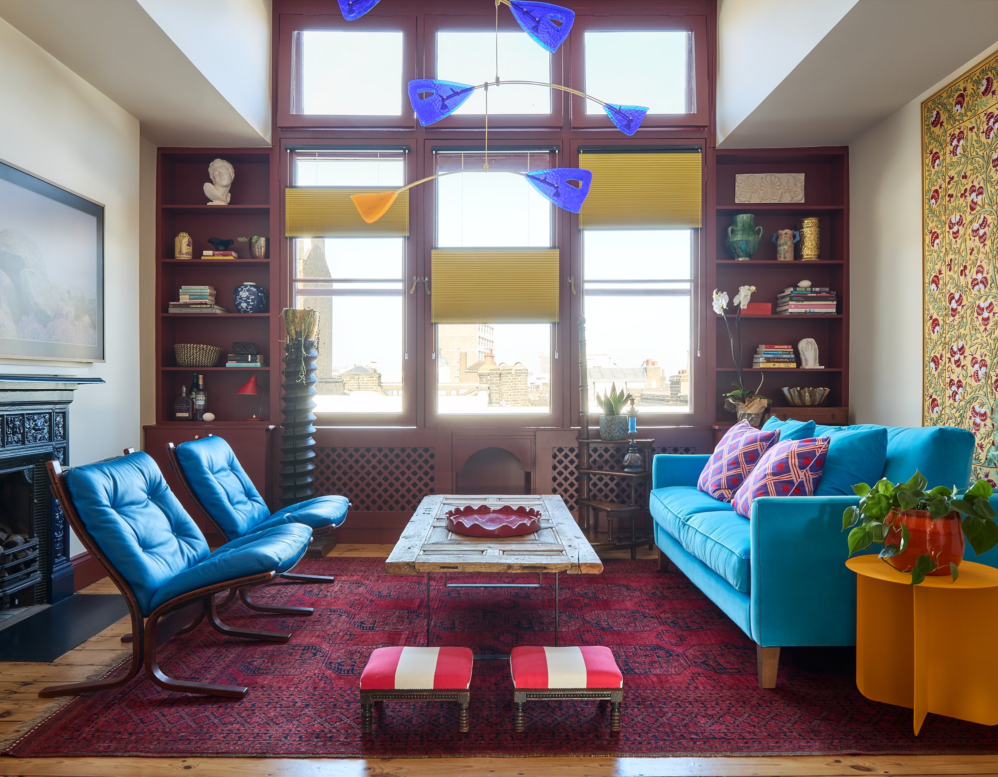
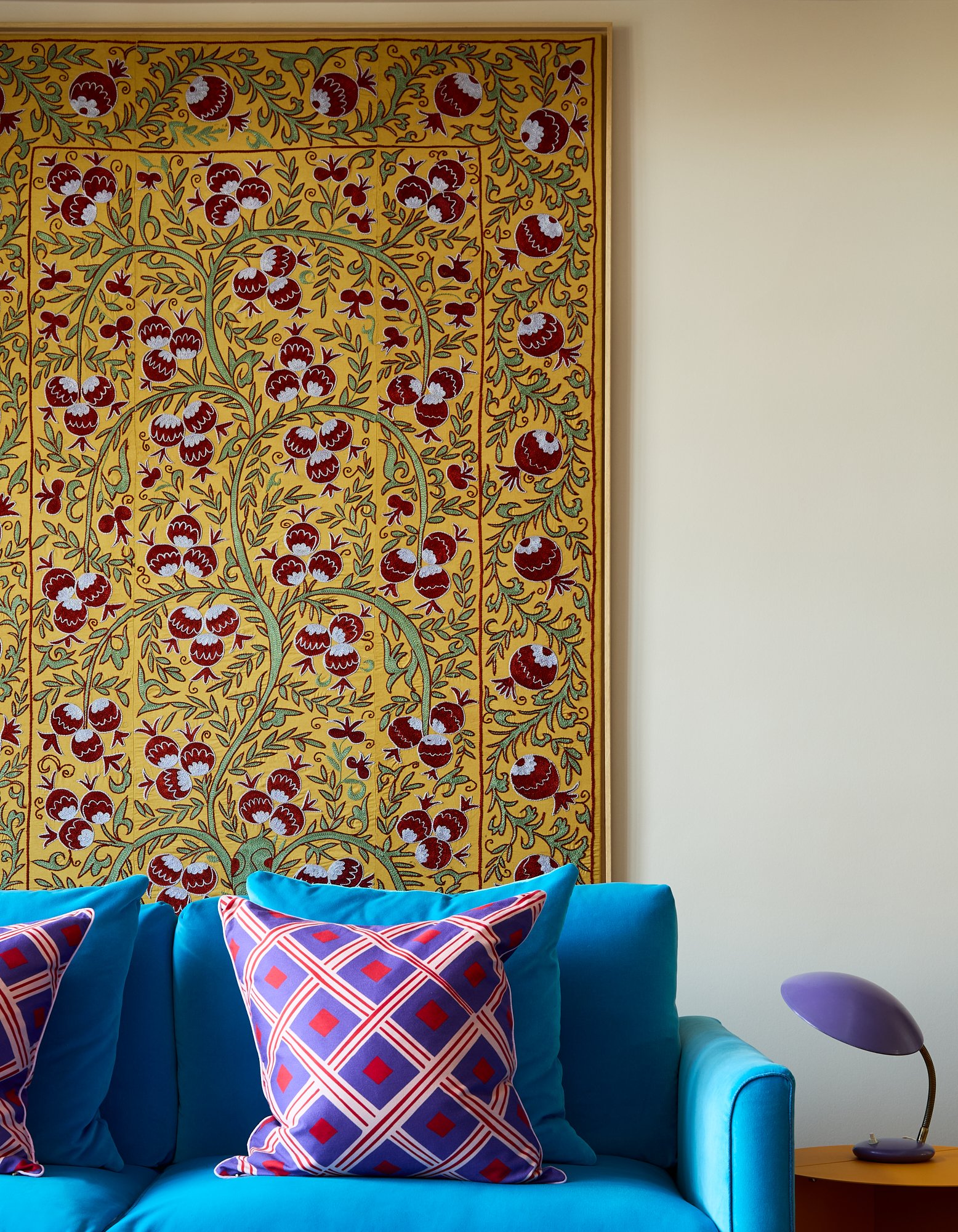
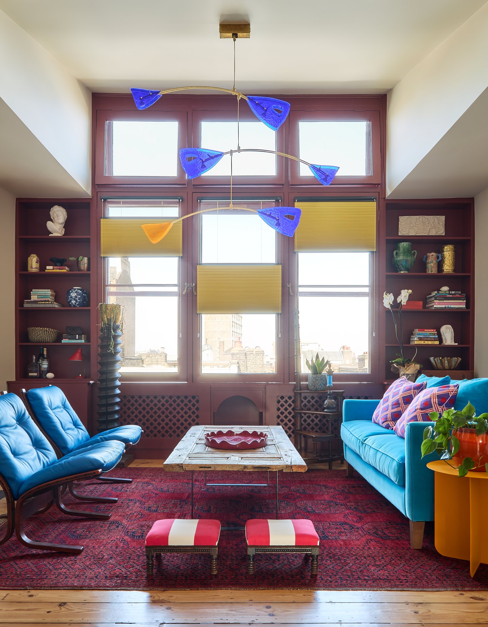
He pushed us in interesting and unexpected ways and this was incredibly rewarding. One example was the sofa that we upholstered in a Schumacher Fabric - Gainsborough Velvet in Blue Jay - we would show him swatches and he would simply come back with the answer to go brighter, again and again. We’ve reflected some of his boldness in graphic prints in the cushions, to celebrate this.
The blue of the sofa is then mirrored with the (also newly upholstered) blue antique chairs, and in the blue Murano glass and brass mobile chandelier - designed by Silvio Piattelli, in a triad.
This room is tied together to give a nod to the Dutch De Stijl art movement with the subtlest of winks to Piet Mondrian. But as you’ll see from the images, the windows, the use of primary colours and the mix of shapes, I like to bend the rules. I’ve used a rich earthy red paint to frame the windows, we have three similar (but not the same) tones of blue, and we have a golden yellow in the Luxaflex blinds, fitted by Sonia Adams.
This room was originally an artist’s studio, so the amount of light that floods into it is significant. Because we’re on the top floor, the windows bathe the room in very pure light from over the rooftops. Given the directness of this light, I went for a special cotton white paint for the walls which we mixed bespoke for this room (you can find out more about my paints here). It’s a soft, gentle white that allows all the items in the room to sit happily alongside each other. It’s the perfect backdrop for the bright furniture and rich red paint on the window frames.
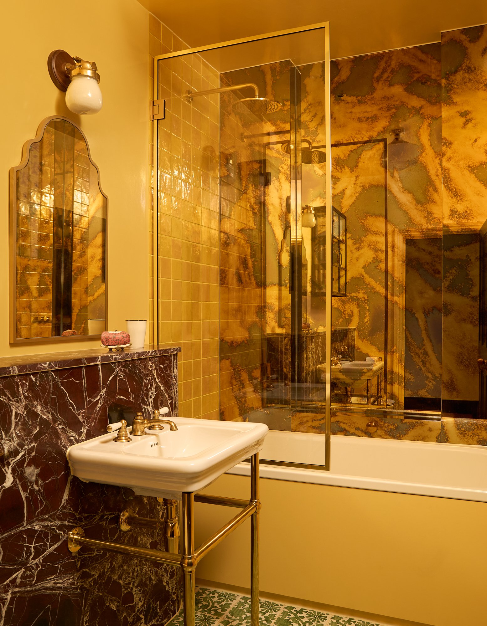
Two additional Rachel Chudley Colour paints we used in this project are a deep inky blue in the hall and a bespoke yellow paint in the bathroom. As the bathroom didn’t have a window, I wanted to bring a feeling of sunshine in, and this exact tone of yellow is so warm it bathes the room in a yolky colour that complements the marble and fittings. Designing bathrooms is one of my favourites, and this bathroom is no exception.
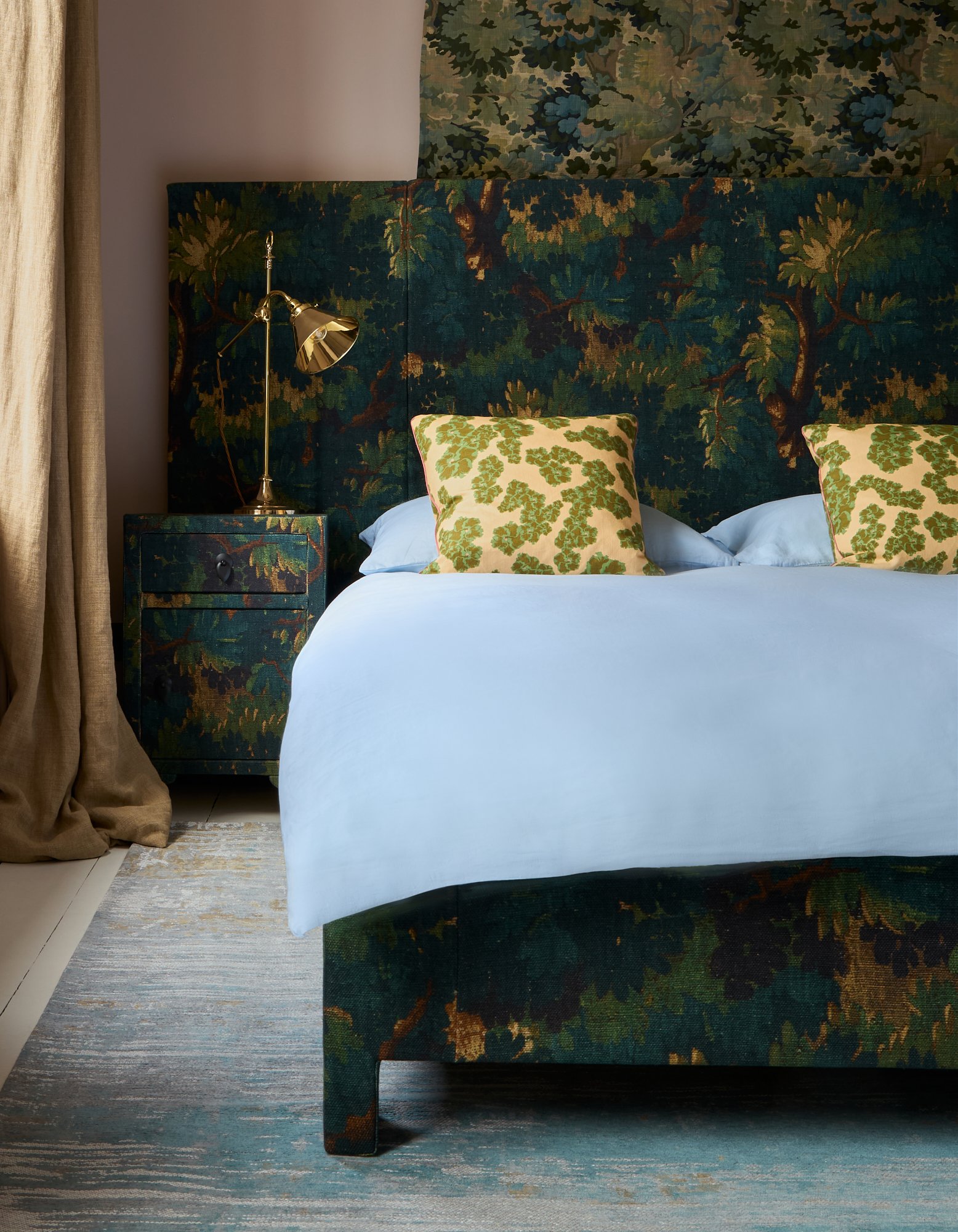
As with all my projects, I often mix contemporary items with antiques. Creating eclectic and unusual combinations that sit easily alongside each other is instinctively how I design. In the master bedroom we have three different floral organic fabrics - and they shouldn’t work together but somehow, they do. The client fell in love with this room for its mix of textures and softness. It’s a bit like being in a treehouse with this kind of interior design, the ceiling depicts the sky, the bucolic mix of fabrics, the leaves; and the curtains, wood. The upholstered side tables and headboard were ambitious - they demonstrate both the determination and the skills and craftsmanship of our upholsterers, given it was such a complex undertaking.
The fabrics used include Dedar Fabric - Scwarzwald Verdure, Watts - Hampstead Verdure and Dar Leone - Ronko Hibiscus Cushions.
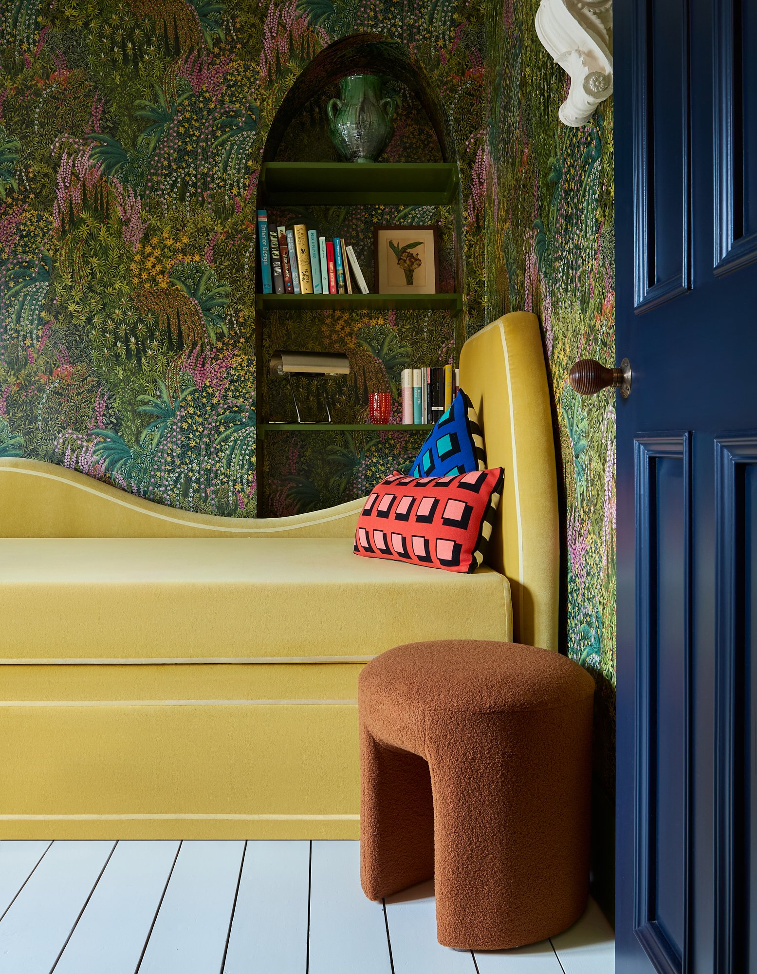
Finally, the spare room with the bespoke yellow daybed is designed to welcome and entice people into this small but functional space. We designed the daybed for multiple uses - a place to escape and relax as well as somewhere to sleep, and if you want extra space, it extends to make it a double bed width. If the master bedroom is the treehouse, this room is most definitely down on the forest floor.
As with all my projects, we often manage to squeeze something unexpected and playful into the mix - enter the secret cabin bed! No pied-à-terre should be without one…
For more on this project, see my instagram @rachelchudley.
Thank you to our client, all of the Elle Decoration team and Boz Gagovski for the beautiful photographs.


